In honour of this weekend’s women’s World Cup final, I thought it would be interesting to do a post looking at how the highest level of women’s football in England, the Women’s Super League, compares with the Premier League in terms of levels of competitive inequality. I’ve calculated the same four measurements used in analysis of the top men’s European leagues (fully outlined and explained in this post), then presented a side-by-side comparison of each measure (for every season it is possible to calculate) since the WSL started in 2011.
A few points to have in mind:
Over the period in question, the WSL’s format has gradually evolved, expanding from an eight team league to a league of twelve teams. You are, therefore, dealing with a shorter season than the Premier League.
Because of the smaller league size for the WSL, I haven’t gone beyond the top four when looking at the turnover measure.
The figures listed here for the WSL for 2017 were for a particularly short interim ‘Spring Series’ competition of just eight games, used to bridge a gap caused by a shift in the overall schedule of the playing season from summer to winter.
Results
For each graph, WSL results are shaded light blue and those for the Premier League are shaded darker.
There are some things that can be clearly see from the results:
After a few early years of flux, the WSL has settled into a very similar pattern to that of the men’s game, with high levels of stability (high correlation in finishing positions from season to season, low levels of turnover in top positions) and high levels of dominance by the winners (in terms of points per game and goal difference per game).
In fact, the figures point to unequal competition having become more of a factor in the functioning of the women’s game than the men’s.
In particular, the top positions of the WSL have been dominated by three teams: Chelsea, Man City and Arsenal. In fact, 2023 marked the first occasion since 2014 that one of these teams finished out of the top three — Man City were fourth, as a result of Man Utd finishing second.
The WSL champions consistently achieve better goal difference than those of the Premier League, built upon large numbers of easy wins. The pinnacle of this was the 2017 Spring Series mentioned above: in the eight games they played, champions Chelsea recorded two 7-0 wins, one 6-0 win and two 4-0 wins.
What can we learn from this?
Unequal access to resources is just as much of an issue for the state of competition within women’s football in England as it is in the men’s game, even if the financial standing of the two leagues are very different. Absurd money is not sloshing around the WSL in the manner it does in the Premier League. In fact, women’s teams remain largely dependent upon their affiliated men’s clubs for much of their funding, which means affiliation with a wealthy Premier League men’s side is becoming almost a prerequisite for any sort of success. Indeed, in the 2022-23 season, the only WSL side not backed by a Premier League team was Reading, who finished bottom and were relegated, after which financial constraints have led them to switch from fully professional to part-time status.
What this also helps to show is that the level of effective competition within a league is not a function of the absolute levels of resources it has access to, but rather as a result of how resources are spread within the clubs in the league. The Premier League has not got less competitive in the past couple of decades because of the increased wealth of its clubs, but rather because of the inequality in resources that has created various levels of hierarchy between those at the top and those lower down. Meanwhile, WSL teams have experienced varying levels of success because some clubs have been quicker and more lavish in the investment they have dedicated to their women’s teams.
The good news for the WSL is that its problems seem easier to remedy, as the ongoing development of the women’s game (aided by, at the very least, a World Cup final appearance) is likely to make more Premier League clubs come to see the benefits of investing in a women’s team, meaning that more teams may be given the resources to challenge in future. The scale of the disparities in the men’s game, meanwhile, feel like far more of a daunting obstacle toward the delivery of a healthily competitive Premier League.
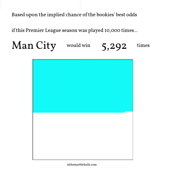
To mark the start of the 2023/24 Premier League season, let’s briefly step aside from the sportswashing posts to assess how this season might go:
A few things to note:
Bookmakers are a little gun-shy on outsiders since Leicester’s incredible 2016 victory. No club this year is given the 5000-1 odds the Foxes won with that season — Luton are the least favoured team this year at 3000-1.
Just seven teams are given greater than a 1% chance of success: the financially mighty six sides who signed up for the European Super League, added to by Newcastle and their Saudi-stocked coffers.
Only nine of the twenty teams have better than a 0.15% chance of victory. The seven above plus Brighton and Aston Villa.
This post offers an overall analysis of the findings of ITMH’s competitive inequality project, tracking the impact of financial inequality upon football. The introductory post explains the measures that are used in the analysis. Individual commentary posts follow, discussing top flight football in Germany, Italy, Spain and England.
Each of the individual league commentaries has noted trends across the four measures of competition I am tracking. But what can be said about the overall picture? Are there any general messages within the data? For each measure, I’ll include a chart showing the rolling averages for each of the leagues plotted alongside each other (they always look a bit messy, but can give some indications of cross league performance) then an overall average of the measure across all four leagues.
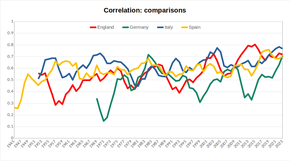
Fig 1: correlation comparison
(Lines here display five-year rolling averages for the correlation value between each season’s finishing positions and those in the preceding season for each of the four leagues discussed. See the introductory post to this series for an explanation of the choice of measurements.)
As noted in the individual commentaries, the Italian league has typically displayed slightly higher levels of year-to-year consistency, while the German and English leagues have been more prone to periods of real flux. All four leagues currently display correlation levels well above historical averages.
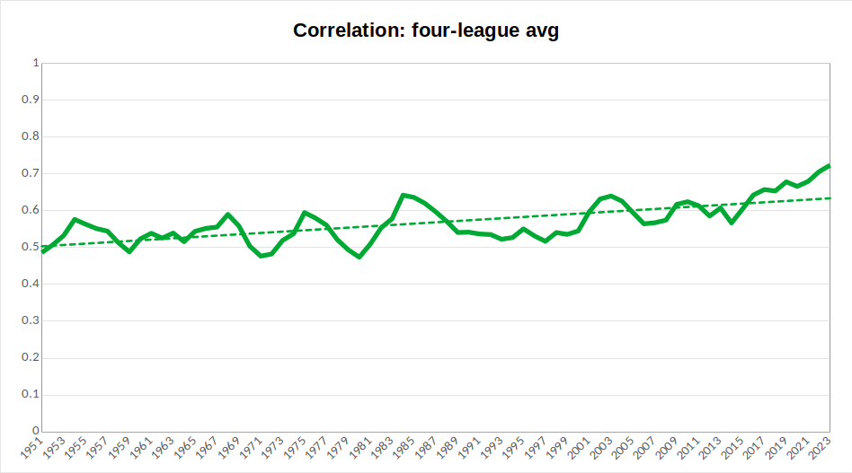
Fig 2: correlation overall average
(The line here displays a five-year rolling average of an average correlation value between each season’s finishing positions and those in the preceding season for each of the four leagues discussed. The dotted line indicates the overall trend in this measure. See the introductory post to this series for an explanation of the choice of measurements.)
An average across the four countries smooths out some of the variation to show a general rising trend across all leagues, indicating less fluidity of finishing positions. Furthermore, at present, the five year rolling average sits well above the trendline, which indicates that this is a trend that may currently be intensifying.
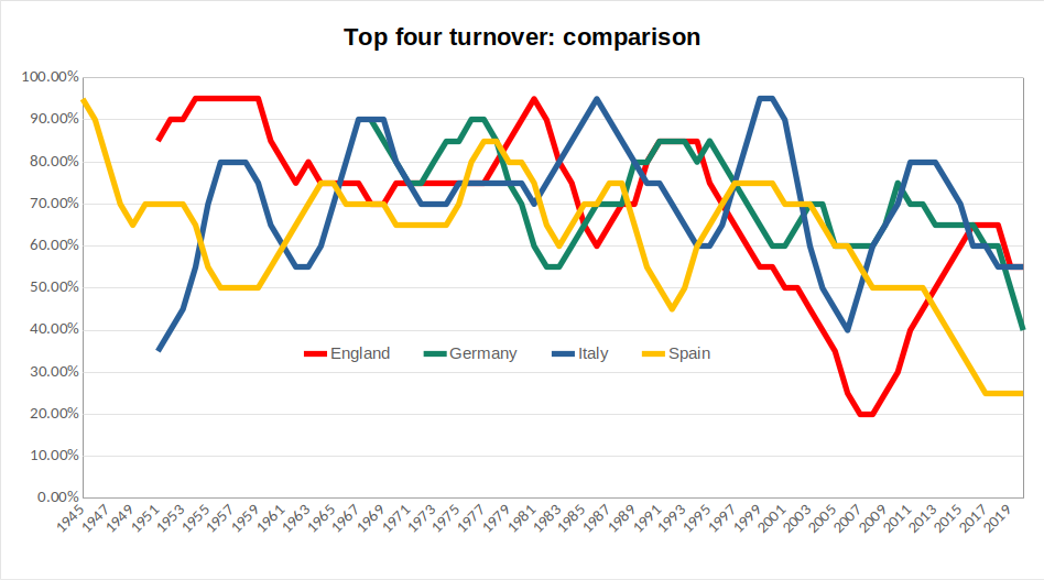
Fig 3: top four turnover comparison
(Lines here represent five-year rolling averages for each of the four leagues of the top four turnover measure, assessing levels of variation among clubs finishing in the top four of each league. See the introductory post to this series for an explanation of the choice of measurements.)
The most notable collective trend across the individual results is that each league has seen periods of sharp decline since the mid-1990s. In England, this is followed by something of a rebound (marking the emergence of a financial Big Six, which created greater competition for top four places), in Spain the decline is steady and continuous, in Italy there remains greater scope for variation.
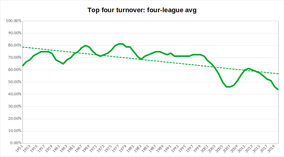
Fig 4: top four turnover overall average
(The line here displays a five-year rolling average of an average of the top four turnover measure, assessing levels of variation among clubs finishing in the top four of each league. The dotted line indicates the overall trend in this measure. See the introductory post to this series for an explanation of the choice of measurements.)
The overall average confirms the above trend: the overall direction of travel is downwards, but this is more marked from around 2000 onwards. Given that this was the point at which the Champions League was opened up to more teams from the biggest leagues, we can point to a clear effect of format changes at the continental level: the wealth attained through big club participation in Europe’s most prestigious competition allows these clubs to maintain a more stable grasp upon the top positions in their domestic leagues. As with correlation measure, the rolling average here sits below the overall trend, indicating this impact is intensifying. With further reform to the Champions League format, potentially enabling greater rewards for participants, even further decline in this measure is possible.
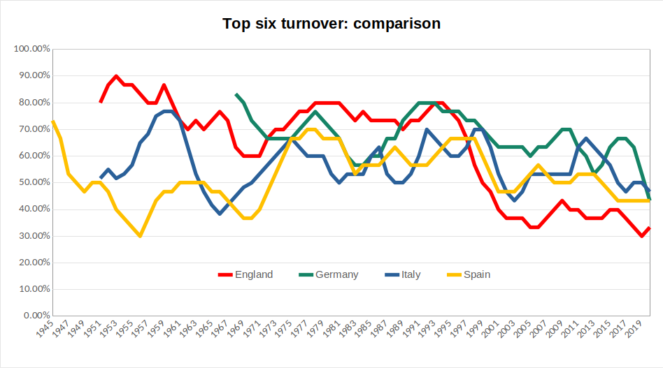
Fig 5: top six turnover comparison
(Lines here represent five-year rolling averages for each of the four leagues of the top six turnover measure, assessing levels of variation among clubs finishing in the top six of each league. See the introductory post to this series for an explanation of the choice of measurements.)
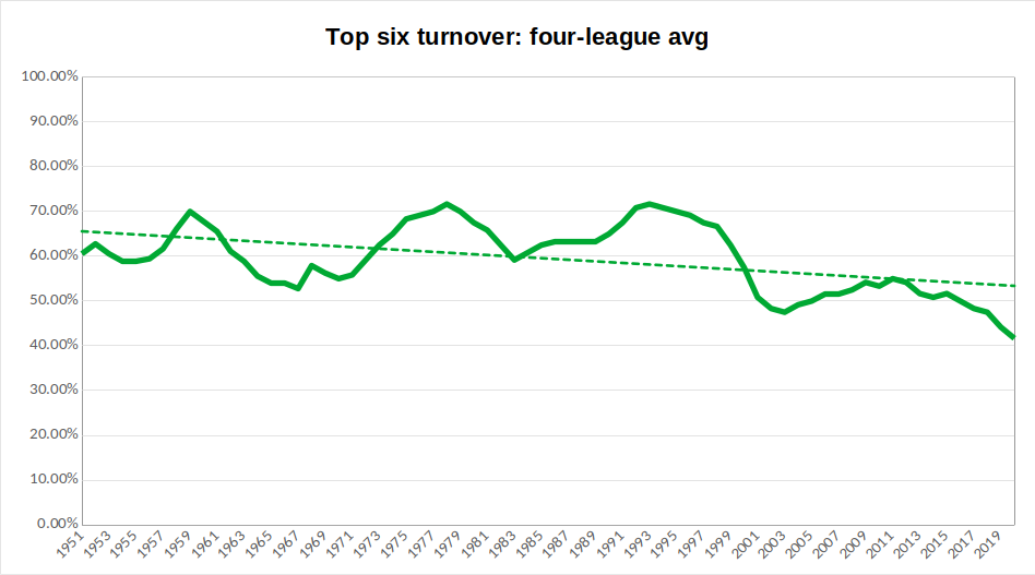
Fig 6: top six turnover overall average
(The line here displays a five-year rolling average of an average of the top four turnover measure, assessing levels of variation among clubs finishing in the top six of each league. The dotted line indicates the overall trend in this measure. See the introductory post to this series for an explanation of the choice of measurements.)
A similar effect is noticeable in the top six turnover measure. Prior to around 1995, there is no real collective trend in the results. Since then, to different degrees, all four leagues have seen decline in this measure. As a result, the decline in the overall average is notable and appears to currently be intensifying.
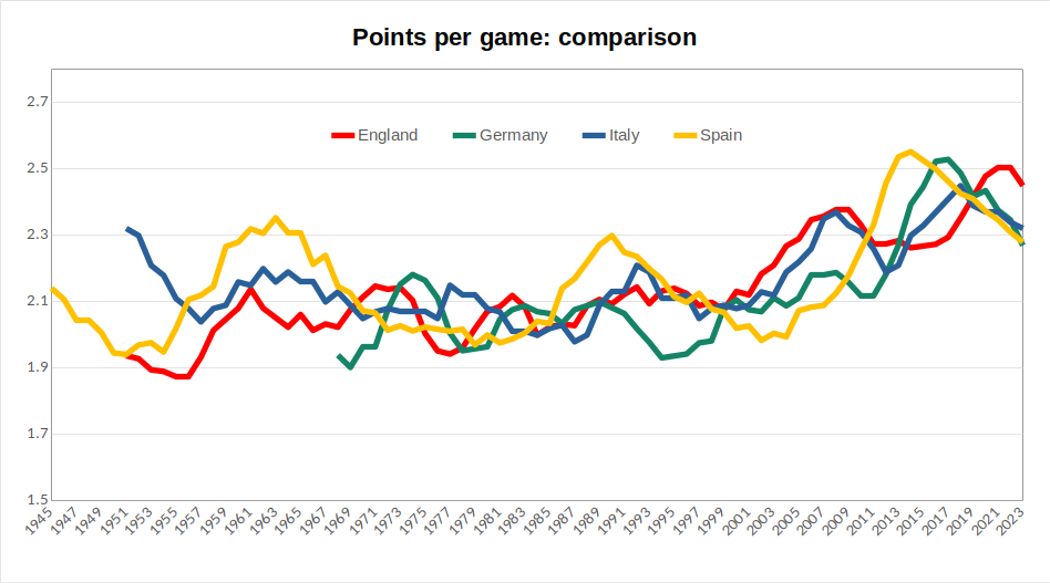
Fig 7: champions’ points per game comparison
(Lines here represent five-year rolling averages for each league of the points won per game by the team that finished champions. See the introductory post to this series for an explanation of the choice of measurements.)
In the individual commentaries, I highlighted the way that measures of dominance for championship winners enable some individual teams to be picked out. We can again, for instance, pick out the pinnacles of Real Madrid in the late 1950s/early 1960s and again in the late 1980s. But, beyond this, what is more apparent is that the recent steep rises in performance are consistent across the leagues, rather than being obviously attributable to individual teams. All four leagues have seen peaks of performance in the past fifteen years that surpass anything seen before.
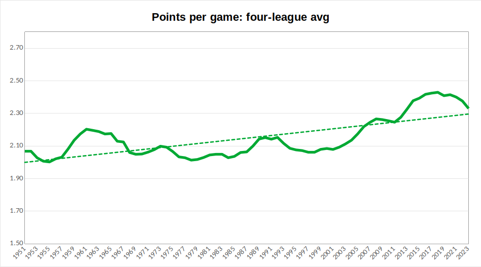
Fig 8: champions’ points per game overall average
(The line here displays a five-year rolling average of an average across the four leagues of points won per game by the team that finished champions. The dotted line indicates the overall trend in this measure. See the introductory post to this series for an explanation of the choice of measurements.)
When I was young, I remember my Dad trying to instruct me of the value of a hard-earned away draw by saying that a team who won all of their home games and drew all of their away games would win the league. Now, the averages here show that, while a title victory would not be entirely certain across these leagues, a two points per game average would certainly have made a team a contender up until about twenty years ago. Since then, it would leave you trailing some way back. So, alongside winning all home games, a team today would probably also need to win about one-third of those away and draw the rest in order to accumulate enough points to pick up a title.
Now, it is worth noting that the past few seasons display some regression in this measure. Is this a sign that we had reached unsustainable levels of dominance, or is it perhaps due to the financial hit taken by many of the big clubs through the pandemic? This is something to monitor in future years.
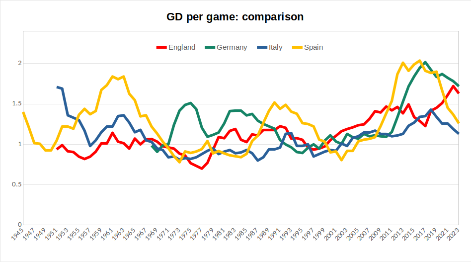
Fig 9: champions’ goal difference per game comparison
(Lines here represent five-year rolling averages for each league of the average goal difference per game of the team that finished champions. See the introductory post to this series for an explanation of the choice of measurements.)
While the overall shape of this chart is similar to that of points per game, with the performance of great teams visible a various different points, followed by a general recent rise, it is notable that the recent performance of Spanish and German champions jumped well clear of the other two leagues before both regressing. It can also be seen that, despite this season being poor by their recent standards, results here would point to Bayern still being the most dominant of the champions of the respective leagues.
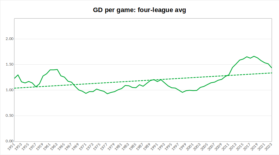
Fig 10: champions’ goal difference per game overall average
(The line here displays a five-year rolling average of an average across the four leagues of the average goal difference per game of the team that finished champions. The dotted line indicates the overall trend in this measure. See the introductory post to this series for an explanation of the choice of measurements.)
As I discussed in the Spanish and Italian commentaries, the period prior to the mid-1960s was one marked by some flamboyant champions. This is something that registers in the overall average here in values that would not be surpassed for another half a century. Recent years have seen champions of the four leagues consistently recording average goal difference of over 1.5 goals per game. The same kind of recent regression seen in respect to average points won is also visible here, so champions are not exerting quite the same level of dominance they managed across the 2010s.
Summary
Across all measures here, support can be found for the conclusion that competition within domestic leagues is profoundly influenced by the format of European competitions. The opening up of the Champions League to non-champions in 1997, then the shift to up to four teams qualifying from top leagues in 1999 corresponds to noticeable upswings in the average correlation of finishing positions, lower turnover in top four and top six finishers, alongside more dominant performances by champions.
In other words, dominance over the past 20 years is different to the dominance of Real Madrid in the late 1950s or Bayern Munich in the 1970s: there is a deeper structural foundation to it in terms of the way the Champions League allows for a massive concentration of financial power in the hands of the continent’s elite clubs, which makes it easier for them to defend their status from domestic challengers. And, with the coming expansion of the Champions League format, the structural unfairness visible within these figures has potential to deepen even further.
This post analyse the Premier League, as part of ITMH’s competitive inequality project, tracking the impact of financial inequality upon football. The introductory post explains the measures that are used in the analysis. See the other posts in this series for commentary on top flight football in Germany, Italy and Spain, or the overall discussion of trends within Europe’s top leagues.
English football has generally been more competitive than Europe’s other main leagues, with its biggest teams exerting less of a stranglehold than elsewhere. Its most successful league side, Manchester United, have 20 titles, whereas in each of Spain, Italy and Germany, the most prominent team has won more than 30 trophies. Across the periods I am tracking in this exercise, England has had 17 different champions, equating to a new club winning the title on average every 4.53 seasons. In the Bundesliga, the average is for a new champion every 4.62 seasons, in Serie A it is 6.42 seasons and in La Liga, where only eight different clubs have won titles since the end of the Civil War, the average is 10.5 seasons.
(You might at this point be thinking that this difference is largely attributable to the period before the formation of the Premier League. However, even since that point (1992-93 onwards), English football has seen more different champions than other leagues, with seven (Manchester United, Blackburn, Arsenal, Chelsea, Manchester City, Leicester and Liverpool), compared to six in Germany and Italy, five in Spain.)
Similarly, with Manchester City’s win at the weekend, England now have supplied six different winners of the European Cup/Champions League – double that of the German or Italian leagues, treble that of La Liga. Equally, England supplied more of the clubs involved in the European Super League proposals, with six (the two Manchester clubs, Liverpool, Chelsea, Arsenal and Tottenham).
This greater competitive openness is one key contributor to the global success of the Premier League. Fans from abroad, entirely unconstrained by ties of community or locality, will tend towards following a larger club with a glorious history, and superstar players that ensure it competes regularly for trophies. Yet, the fact that the English league offers multiple such options provides it with greater interest: more crucial clashes with other significant teams, greater scope for banter with other fans, a wider set of different clubs who can entertain hopes of success. At present, therefore, English football commands higher global audiences, bringing greater revenue from television rights, which in turn makes its clubs the most attractive trinkets as billionaire playthings or soft-power vehicles for reputationally compromised petro-states. This cycle (I’ll leave it up to you to make a value judgement over whether it is virtuous or vicious) has given English clubs (and not just those at the very top) spending power that few are able to match elsewhere.
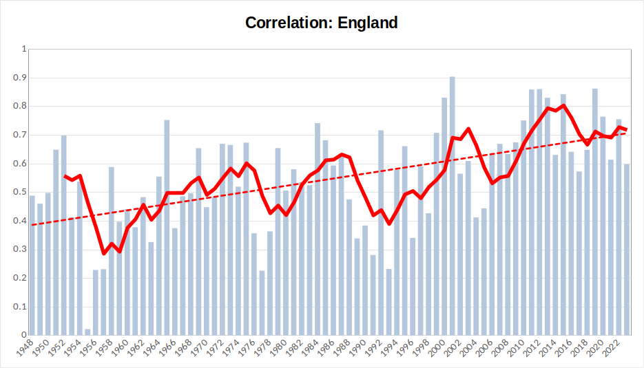
Fig 1: correlation
(Bars here represent the individual correlation value between each season’s finishing positions and those in the preceding season. The red line is a five-year rolling average to pick up on trends in the medium term. The dotted line is an overall trendline representing the overall direction of travel for this measure across the results. See the introductory post to this series for an explanation of the choice of measurements.)
The easiest way to appreciate the findings of this chart is to begin by focussing on this season’s Premier League standings. Yes, Manchester City claimed the title again (for the fifth time in six years), but otherwise, the table this year felt full of surprises: Arsenal and Newcastle finished in the Champions League places, Liverpool and (more spectacularly) Chelsea did not; Brighton, Villa, Brentford and Fulham all recorded impressively high finishes, Leicester, Everton and West Ham under-performed their recent records. Now look at the correlation figure for this season: a hair shy of 0.6. The only recent year with a lower figure is 2016 (when, amongst other things, Leicester jumped from 14th position to 1st, while Chelsea dropped from 1st to 10th). Yet, trace the 0.6 line further back and you will see that, prior to the start of the 21st century, a year-to-year correlation in finishing positions of 0.6 would actually have indicated a relatively high figure, with finishing positions frequently characterised by much greater volatility. We can see from this that the past 20 years have been a period of significantly greater league stability and predictability than what had come before.
Across the chart, while the rolling average takes a jagged saw-tooth shape, the overall trend is clearly one of a steady increase in correlation, showing that the league has become less open and fluid.
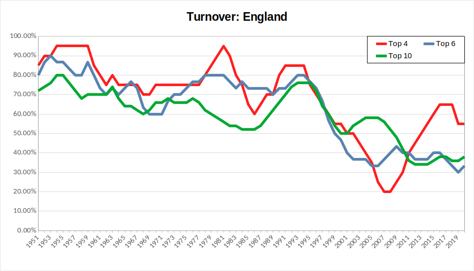
Fig 2: turnover
(Lines here represent five-year rolling averages for the turnover measure, assessing levels of variation among clubs finishing in the top two, top four, top six and top ten (in seasons with a 20+ team league) of the league. NB – since the calculation of this measurement relies upon future finishing positions, the current season’s figure can only be known in three year’s time. The latest figure, therefore, is for the 2019-20 season. See the introductory post to this series for an explanation of the choice of measurements.)
The turnover chart, if anything offers even more stark evidence of the change in English football in recent decades. From the mid-1990s (shortly after the formation of the Premier League), turnover among the top four, top six and top half of the league steeply drops away. The emergence of Manchester City and (to a lesser extent) Tottenham as challengers at the top is responsible for the rebound in top four turnover from the late 2000s onwards – when it had, for a while, looked as though Manchester United, Chelsea, Arsenal and Liverpool were taking almost total control of these places. Yet, it remains the case that the upper parts of the Premier League have become dominated by a small group of clubs. We shall have to see whether this season, in which some teams other than the usual suspects were prominent in the Premier League’s upper reaches, was more of a blip or a sign of new long-term challengers (such as Saudi-backed Newcastle United) emerging.
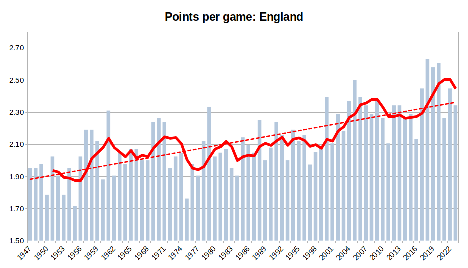
Fig 3: points per game
(Bars here represent the average points won per game by the team that finished champions that season. The red line is a five-year rolling average to pick up on trends in the medium term. The dotted line is an overall trendline representing the overall direction of travel for this measure across the results. See the introductory post to this series for an explanation of the choice of measurements.)
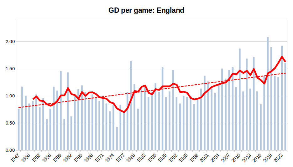
Fig 4: goal difference per game
(Bars here represent the average goal difference per game recorded by each season’s title winners. The red line is a five-year rolling average to pick up on trends in the medium term. The dotted line is an overall trendline representing the overall direction of travel for this measure across the results. See the introductory post to this series for an explanation of the choice of measurements.)
The charts for English champions are less of a tale of specific great teams than those of the continent’s other major leagues (although, on both charts, Liverpool’s team of 1978-79 stands out as something out of the ordinary), but instead that of a steadily rising trend in performance, becoming particularly strong from 2000 onwards and peaking (for now, at least) in the season of Pep Guardiola’s first Manchester City title win in 2017-18.
Summary
The above results are pretty unsurprising for any English football fan. Since the formation of the Premier League in 1992 and the opening up of the Champions League to allow multiple teams from larger leagues from the late 1990s onwards, there have been marked trends for less fluidity in finishing positions, dominance of higher positions by a select group of clubs and higher levels of sustained performance by title winners. All of these are indications that the increasing inequality in English football are harming the levels of competitive openness that have been one of its selling points.
This post analyses La Liga, as part of ITMH’s competitive inequality project, tracking the impact of financial inequality upon football. The introductory post explains the measures that are used in the analysis. See the other posts in this series for commentary on top flight football in Germany, Italy and England, or the overall discussion of trends within Europe’s top leagues.
La Liga, the Spanish Primera Division, was founded in 1929, but the analysis below tracks performance across the period since its resumption after the end of the Spanish Civil War. The common perception of the league is that it is pretty much a duopoly between Real Madrid and Barcelona, who have recorded 35 and 27 titles respectively. Other prominent Spanish sides include Atletico Madrid, Valencia and Athletic Bilbao.
Spain also possesses the most success in the European Cup/Champions League, mainly due to Real Madrid’s 14 victories, with Barcelona also having lifted the trophy five times. These two clubs, as well as Atletico Madrid, were participants in the proposed European Super League, with Real’s president, Florentino Perez, slated to be the chairman of the new league. As of 6th June this year (when Juventus finally abandoned the project), Real and Barcelona remain the only clubs still publicly committed to the breakaway proposals.
Fig 1: correlation
(Bars here represent the individual correlation value between each season’s finishing positions and those in the preceding season. The red line is a five-year rolling average to pick up on trends in the medium term. The dotted line is an overall trendline representing the overall direction of travel for this measure across the results. See the introductory post to this series for an explanation of the choice of measurements.)
The chart here displays a general upward trend. The initial period after the Civil War was one of real flux, including one season where finishing positions were negatively correlated: i.e. a team with a high finishing position the previous season was actually (slightly) more likely to subsequently finish in the lower parts of the league and vice versa. In general, the results vary widely from year to year, with some years of greater stability and others of greater variation. The past ten years mark something of a departure from this, with consistent figures of around 0.6 or higher. As a result, the rolling average has hit higher levels than any previous period. This points to a greater level of predictability of league finishing positions over this period.
Fig 2: turnover
(Lines here represent five-year rolling averages for the turnover measure, assessing levels of variation among clubs finishing in the top two, top four, top six and top ten (in seasons with a 20+ team league) of the league. NB – since the calculation of this measurement relies upon future finishing positions, the current season’s figure can only be known in three year’s time. The latest figure, therefore, is for the 2019-20 season. See the introductory post to this series for an explanation of the choice of measurements.)
As noted above, the perception of La Liga is that it is almost always simply about Real Madrid and Barcelona, so I’ve included a top two turnover calculation. In fact, what this shows is that is has rarely been the case that these two finish first and second season after season – it has only really been the case that this has occurred at all in the late 1950s/early 1960s and from the mid-2000s onwards. So, while these two clubs are the undoubted powerhouses of Spanish football, they have always faced a challenge from other clubs for absolute supremacy, with Atletico providing the most recent disrupting force.
There may, however, be the threat of a triopoly taking control at the top. The most notable recent trend here is a sharp decline over the past fifteen years in top four turnover. In fact, the last time any of the three Spanish clubs involved in the European Super League finished outside of the top three was in 2011-12, when Atletico finished fifth. This does represent a real worry for the state of competition in Spanish football.
Fig 3: points per game
(Bars here represent the average points won per game by the team that finished champions that season. The red line is a five-year rolling average to pick up on trends in the medium term. The dotted line is an overall trendline representing the overall direction of travel for this measure across the results. See the introductory post to this series for an explanation of the choice of measurements.)
The rolling average here displays three clear and prominent waves, corresponding to the eras of three great teams, with performance falling away in between. The first era is that of Real Madrid dominance in the 1950s and 60s, stretching from the Di Stefano/Puskas team that swept all before it in European football through to the Yé-yé team who claimed a sixth European Cup in 1966. The second, slightly lower wave corresponds to the era of Real’s excellent Quinta del Buitre team of the late 1980s who, while ultimately falling short in the European Cup, won five successive La Liga titles.
Then, the most recent – and highest – of the waves is that initiated by Pep Guardiola taking up the coaches position at Barcelona. Subsequently, that Barcelona team won eight of the next eleven titles. This era has also marked a predominance of Spain’s top two clubs in European football, winning seven out of ten Champions League trophies from 2009 to 2018. While the graph shows Spanish football is clearly on the down-slope from that peak of brilliance, present levels remain consistently higher than all but the highest performances from the past.
Fig 4: goal difference per game
(Bars here represent the average goal difference per game recorded by each season’s title winners. The red line is a five-year rolling average to pick up on trends in the medium term. The dotted line is an overall trendline representing the overall direction of travel for this measure across the results. See the introductory post to this series for an explanation of the choice of measurements.)
The same three wave formation is visible when looking at goal difference trends, yet with the first and third waves being even more prominent, attesting to the greatness of sides in those eras. It does become clear here how much the period that has just ended in Spain, of Messi at Barcelona and Ronaldo at Real Madrid, will come to be seen as a time of otherworldly prowess. Just take a second to reflect upon this: over the period Ronaldo was at Real (2009-2018), he and Messi made 601 La Liga appearances between them, scoring a total of 640 goals. That’s an average of 1.06 goals per game each. For a period of nine seasons. (For perspective Erling Haaland’s scoring exploits in this season’s Premier League actually fall short of that figure, with him averaging only (!) 1.03 goals per game.)
By the way, that dip right in the centre of the latest wave – that’s the season Atletico battled their way to the title in 2014. While they were far from playing a spoiling style, they were unable to match the extraterrestrial performance of their rivals.
The past five seasons have seen this measure return to those more typical of overall averages.
Summary
Although its history has witnessed several spectacularly brilliant teams, La Liga has probably been more competitive than many would imagine. Indeed the excessive prominence of its two biggest sides is something that has only really become a phenomenon in the 21st century. Even now, however, the worry for levels of domestic competition may be more about whether the top three sides are attaining levels that the rest of the league is increasing unable to match.
In respect to the status of Spanish teams in Europe, the recent era saw a period when Real Madrid and Barcelona were regarded as the ultimate club sides in the world. For any player with aspirations of being considered the world’s best, playing for one of these sides seemed to be non-negotiable. As financial might has shifted towards the Premier League in recent seasons, this currently no longer seems the case. It will be interesting to see whether this is simply a short-term lull in their fortunes, or whether they are in danger of being permanently eclipsed at the top of the club game. The ongoing financial woes of Barcelona and the persistence with which they and Real have clung to the wreck of the European Super League suggests the latter is a very real possibility.
This post analyses Serie A, as part of ITMH’s competitive inequality project, tracking the impact of financial inequality upon football. The introductory post explains the measures that are used in the analysis. See the other posts in this series for commentary on top flight football in Germany, Spain and England, or the overall discussion of trends within Europe’s top leagues.
Serie A has formed the single top national league in Italy since the 1929-30 season. The analysis below tracks performance across the period since its resumption after WWII. Over this period, three teams have consistently claimed most success: Juventus (36 championships in total, 29 of which are post-war); Internazionale (19 championships – 14 post-war); Milan (19 championships – 16 post-war). Other major contending teams include the two Rome clubs (Roma and Lazio), Napoli and Fiorentina.
The three dominant Italian clubs have also won 12 European Cup/Champions League trophies between them (Milan 7, Inter 3, Juventus 2). All three participated in the European Super League proposal, with the Juventus chairman, Andrea Agnelli, being thought to be one of the prime protagonists behind the plans. Indeed, Juventus only signalled their intention to pull out of the enterprise in recent days (6th June 2023).
Methodological mithering: in keeping with the national talent for Machiavellian subterfuge, Italian football has frequently descended into scandal, resulting in much greater use of points deductions than in other major leagues. This leaves a choice to be made when assessing league finishing positions between what has been determined by performance on the field and that subsequent to the application of penalties. E.g. in 2005-6, Juventus finished at the top of the Serie A table, but were subsequently penalised for their involvement in the Calciopoli scandal by being officially placed bottom of the table and relegated to Serie B. For the sake of this exercise, should their finishing position be recorded as 1 or 20; should it be their record, or that of the team subsequently awarded the title (Inter) that counts to points per game and GD per game calculations? My choice has been to, throughout the Italian results, use a raw league table based upon finishing positions as if there were no deductions, as this feels truer to the purpose of the assessment by reducing any artificial volatility.
Fig 1: correlation
(Bars here represent the individual correlation value between each season’s finishing positions and those in the preceding season. The red line is a five-year rolling average to pick up on trends in the medium term. The dotted line is an overall trendline representing the overall direction of travel for this measure across the results. See the introductory post to this series for an explanation of the choice of measurements.)
Of the four leagues I’m looking at as part of this exercise, Serie A generally exhibits the highest average correlation between finishing positions from year to year. While the individual bars show great variation, the rolling average is typically operating at a slightly higher level than other leagues. This suggests that Italian football may possibly have developed an established order of clubs at an earlier stage, and have maintained this more thoroughly than other countries. It certainly is pronounced that Italian football is dominated by teams from its largest (and in the case of its three dominating clubs, its most affluent) cities, with fewer provincial upstarts than elsewhere. This lends credence to the idea that finance has mattered more, for longer, in the Italian league than with other major European leagues. Further support for this idea would come from the fact that, while the overall trend for this measure is upwards, the increase is less pronounced than that seen in some other leagues, suggesting that the effects of money are already baked into Italian football to a greater degree.
Also of note is the fact that recent years (since 2011) have been characterised by sustained higher levels of correlation, which have driven the averages up steadily.
Fig 2: turnover
(Lines here represent five-year rolling averages for the turnover measure, assessing levels of variation among clubs finishing in the top four, top six and top ten (in seasons with a 20+ team league) of the league. NB – since the calculation of this measurement relies upon future finishing positions, the current season’s figure can only be known in three year’s time. The latest figure, therefore, is for the 2019-20 season. See the introductory post to this series for an explanation of the choice of measurements.)
There is little in the way of overall trend for the turnover measurements for both top four and top six finishing positions in Serie A. With each, there is fluctuation between periods of greater or lesser turnover, yet it tends to consistently regress towards a mean of around 70% for top four turnover and 55% for top six turnover. The fact that top six turnover is in this range in a league with three dominant clubs suggests that, in most years, it is highly likely that these three finish in the top six, although they have not been able to colonise the top four, as evidenced by higher turnover at this level.
The measure for top ten turnover is only calculated following the expansion of the league to 20 teams in 2004-5 – it does not seem particularly worthwhile to calculate earlier than this for a group that would comprise more than half of the league. Yet, the short period in which this has been tracked sees a rapid decline in turnover levels, suggesting some degree of consolidation among more successful clubs that will be worth watching in future.
Fig 3: points per game
(Bars here represent the average points won per game by the team that finished champions that season. The red line is a five-year rolling average to pick up on trends in the medium term. The dotted line is an overall trendline representing the overall direction of travel for this measure across the results. See the introductory post to this series for an explanation of the choice of measurements.)
The rolling average here traces a loose upward sloping u-shape, being higher in the immediate post-war, lower through the 1970s, 80s and 90s (with odd exceptional higher performance such as from Juventus in 1976-77 and Inter in 1988-89), then generally higher levels of performance in the 21st century, capped by Juventus’s romp to 102 points in 2013-14.
Fig 4: goal difference per game
(Bars here represent the average goal difference per game recorded by each season’s title winners. The red line is a five-year rolling average to pick up on trends in the medium term. The dotted line is an overall trendline representing the overall direction of travel for this measure across the results. See the introductory post to this series for an explanation of the choice of measurements.)
Italian football is all about tight, stifling defensive tactics, right? Well, yes, but it wasn’t always like that. You can clearly see the period in which Catenaccio fully emerged and became the defining Italian football mindset from the chart’s results – Helenio Herrara’s Inter team, who deployed it effectively the dominant force in both Italian and European football in the mid-1960s, became a model for much of what was to follow.
Prior to that, however, the immediate post-war period featured some incredible free-scoring performances from Italian champions. In 1950-51, Juventus, Inter and the eventual champions – a Milan side led by their Gre-No-Li Swedish attacking trio – each scored more than 100 goals in a 38-game season. But, the absolute pinnacle of post-war Serie A were the exploits of the dominant but ill-fated Grande Torino team who won five titles over the period of the war and its immediate aftermath. Their finest performance came in 1947-48, a season in which they scored 125 goals in 40 games, recording five or more strikes in half of their home matches, which included a 10-0 victory over Alessandria.
Unfortunately, tragedy would strike that team. In May 1949, in poor visibility from adverse weather conditions, the plane carrying them home from a friendly with Benfica in Lisbon crashed into one of the walls of the Basilica of Superga, which stands on a hill over Turin. None of the 31 on board, including team players and coaches survived the crash. Unlike Manchester United, who were able to return to prominence after a similarly tragic crash in the following decade, Torino have never again been a force in Italian football – they managed a solitary title in 1975-76, but have also had spells in Serie B and currently are a resolutely mid-table Serie A club.
In recent years, Italian title winners have been recording higher goal difference levels than the 1960s-1990s period. They have not, however, been able to get close to the incredible performance of that legendary Torino side.
Summary
This project is primarily interested in the impact of recent flows of money into football, and how this might be making the game more unequal and less competitive. The Serie A results show some evidence for this, with slight upward trends in correlation, reduced turnover in higher league positions and stronger performance from champions. However, it is also clear that Italian football has always displayed signs of stratification of clubs, making these trends less pronounced than they are elsewhere.
This post analyses the Bundesliga, as part of ITMH’s competitive inequality project, tracking the impact of financial inequality upon football. The introductory post explains the measures that are used in the analysis. See the other posts in this series for commentary on top flight football in Italy, Spain and England, or the overall discussion of trends within Europe’s top leagues.
The Bundesliga was founded in the early 1960s, much later than other major national leagues. Since its inception, one club – Bayern Munich – has been consistently preeminent (winning 32 of a possible 60 titles), with the likes of Borussia Mönchengladbach (1970s), Hamburg (late 1970s/early 1980s) and Borussia Dortmund (1990s-present) providing the primary challenge.
German clubs have claimed eight European Cup/Champions League trophies, with Bayern the most successful, with six titles. No German clubs were involved in 2021’s abortive European Super League plans, although there are good grounds for thinking that, had the proposal been successful, two of the 15 proposed permanent members spots would have been offered to Bayern and Dortmund.
Fig 1: correlation
(Bars here represent the individual correlation value between each season’s finishing positions and those in the preceding season. The red line is a five-year rolling average to pick up on trends in the medium term. The dotted line is an overall trendline representing the overall direction of travel for this measure across the results. See the introductory post to this series for an explanation of the choice of measurements.)
Despite the single team dominance of the league, results of the correlation analysis show consistent variation throughout the league’s existence. There are periods of greater stability (1980s, noughties), but also seasons characterised by major flux (1978-79, 1995-96, 2010-11, 2011-12). The overall trend across the results shows a gradual increase in correlation levels. In the shorter term, since the early 2010s there has been a steep upswing in correlation, meaning that we are currently in a period where finishing positions are more predictable and stable from year to year.
Fig 2: turnover
(Lines here represent five-year rolling averages for the turnover measure, assessing levels of variation among clubs finishing in the top four and top six of the league. NB – since the calculation of this measurement relies upon future finishing positions, the current season’s figure can only be known in three year’s time. The latest figure, therefore, is for the 2019-20 season. See the introductory post to this series for an explanation of the choice of measurements.)
The turnover measurements for both top four and top six finishing positions in the Bundesliga track each other pretty closely. For both, there are periods of relative consolidation in the early 1980s and across the 21st century. The graph shows the current period has been marked by a rapid short term decline in turnover, point to greater consolidation of top positions among a small number of clubs. Indeed, four teams (Bayern, Dortmund, RB Leipzig & Bayer Leverkusen) have all finished in the top six in every season since 2017-18. The chart shows that this level of concentration is something new within German football.
Fig 3: points per game
(Bars here represent the average points won per game by the team that finished champions that season. The red line is a five-year rolling average to pick up on trends in the medium term. The dotted line is an overall trendline representing the overall direction of travel for this measure across the results. See the introductory post to this series for an explanation of the choice of measurements.)
In the early years of the Bundesliga, the title-winners frequently ended up with a points total with an average of less than two points per game, with Bayern’s all-conquering early-1970s team providing an early exception by recording more than 2.3 points per game in both 1971-2 and 1972-3 seasons.
Since 2010, the chart displays a significant jump upwards, with subsequent champions (well, almost entirely Bayern – who have won the last 11 consecutive titles) frequently recording records that match or surpass that of the Beckenbauer/Gerd Muller era team. While the overall trendline shows a steady rise in performance by title winners, the recent trend records a decline over the past few seasons with a marked drop-off in 2022-23, as Bayern’s current team have declined (despite winning the title this season, it was clear to all that this year’s Die Roten side should no longer be considered a major force among Europe’s best). It will be interesting to watch whether this measure drops back to consistent historical levels (c. 1.9 to 2.2 points per game), marking Bayern of the 2010s as something rather special, or whether this season’s relative low is the aberration on a overall shift to a general higher level for title winners.
Fig 4: goal difference per game
(Bars here represent the average goal difference per game recorded by each season’s title winners. The red line is a five-year rolling average to pick up on trends in the medium term. The dotted line is an overall trendline representing the overall direction of travel for this measure across the results. See the introductory post to this series for an explanation of the choice of measurements.)
This measure confirms the analysis of points per game outlined above: Bayern’s team of the early 1970s were something well above the general level of performance seen by German champions; however, their record has been consistently matched and sometimes surpassed by Bayern teams of recent vintage. Again, while the overall trend is upwards, the past few seasons have seen a slight decline. Future results will be worth watching, to assess whether or not recent levels of dominant performance by Bayern represent a new norm for German football.
Summary
In the Bundesliga trends across the data show greater correlation of finishing positions from season to season, declining turnover of teams at the top of the league and a shift towards more dominant performances by league champions. All of these measures are consistent with a decline in competitiveness and greater predictability of league outcomes.
Earlier this week, under angry, thundery skies, Manchester City paraded the spoils of a dominant season through the streets of Manchester. While their first Champions League victory allows them to finally claim a much longed-for place at the head of European football, their domestic dominance was already assured, with this season seeing them claim a fifth Premier League in the past six years, a period in which they have also managed six domestic cup victories.
Throughout football’s history, there have always been dominant teams. In the earliest years of the English Football League, Preston North End, Sunderland and Aston Villa vied for dominance; more recently Liverpool and Manchester United have both held the title claimed by City today of being English football’s unarguably pre-eminent power. In Europe, clubs like Real Madrid, Juventus and Bayern Munich have records of domestic success beyond anything displayed by any English team. Is it justified, therefore, for City’s current success to be consistently accompanied by hand-wringing about inequality? Is the situation today any less competitive than when Liverpool finished in the top two for ten straight seasons from the 1980s to early 1990s?
The posts within this project utilise four simple measures to attempt to assess the health of competition within the top European leagues and examine whether the sense that many fans possess – that the level of resources available to the teams at the top is harming the game – is reflected on the pitch.
Firstly, in a healthy, open competitive environment, you would expect to see a measure of flux in terms of league finishing positions. Each team is attempting to outperform others, to find tactical innovations or smart transfers that allow them to gain an edge over rival teams, so we should expect to see turnover in standings, both across each country’s highest league and also among the very top positions, as teams go through periods of relative success and failure. On the contrary, were success on-the-field to largely be a function of the off-the-field resources available to a club, we might expect to see a greater level of predictability and stability in finishing positions, with less movement and the emergence of some degree of sorting of clubs into tiers of relative performance.
The first two proposed measurements (adapted from measures used within a similar effort to measure levels of competition in commercial markets in Thomas Philippon’s The Great Reversal) try to capture this:
Year-to-year correlation of finishing position. Simply by assessing how much a team’s finishing position in a league table correlates to their position the year before, we can track the extent to which a finishing place one year might be thought to influence that the following year: e.g. if a team finishes 6th, if correlation is higher, they are more likely to finish in a position close to 6th the following year; a lower figure would suggest a greater range of probable outcomes. This measure therefore allows the overall stability of league finishing positions to be tracked. If correlation is increasing, this would be consistent with the claim that money was undermining the unpredictability of league competitions.
Levels of turnover at the top of the league. While the level of flux across an entire league is important, it means little if there is massive fluidity of teams lower in the league, yet the top few places are dominated by a small elite. So we might also look to assess the probability that a team who finish in the top few places dropping away to a lower finishing position at any time over the subsequent three seasons. This can give us an indication of the extent to which positions towards the top of a league become easier for elite clubs to defend. A lower figure here indicates a lower probability of top teams subsequently failing to finish in higher league positions. In discussion of specific leagues I’ll mention calculations based on the percentage of the top two, top four, top six and top ten places, depending upon the size of the league and an assessment of the shape of competition at the top.
Yet, as well as assessing the levels of fluidity in leagues as a whole, another key consideration is the scale of dominance exercised by the clubs at the very top. Is the gap between league champions and the also-rans wider than it was in the past? Two further simple measurements can capture this:
Points-per-game of champions. If there is a greater gap between the elite and the rest, you would expect elite clubs would record more victories and fewer defeats than champions of the past, which would result in higher points totals. (To allow for comparison, points have been calculated based on league records on the basis of three points per win, applying this even to leagues that were played under a two points per win rule. In a future post, I will consider whether the shift to three points for a win led to a different mindset and approach, which could therefore impact upon the figures used here.)
Average goal difference per game. Similar to the above, increases in the gap at the top would be likely to register in greater margins of victory and avoidance of anything but narrow defeats.
An increase in either of these measures over time would be evidence of a greater gap between teams at the top and the remainder of their respective leagues.
Armed with these four measurements, the next few posts will track trends in competition across some of Europe’s top leagues.