
This post offers an overall analysis of the findings of ITMH’s competitive inequality project, tracking the impact of financial inequality upon football. The introductory post explains the measures that are used in the analysis. Individual commentary posts follow, discussing top flight football in Germany, Italy, Spain and England.
Each of the individual league commentaries has noted trends across the four measures of competition I am tracking. But what can be said about the overall picture? Are there any general messages within the data? For each measure, I’ll include a chart showing the rolling averages for each of the leagues plotted alongside each other (they always look a bit messy, but can give some indications of cross league performance) then an overall average of the measure across all four leagues.
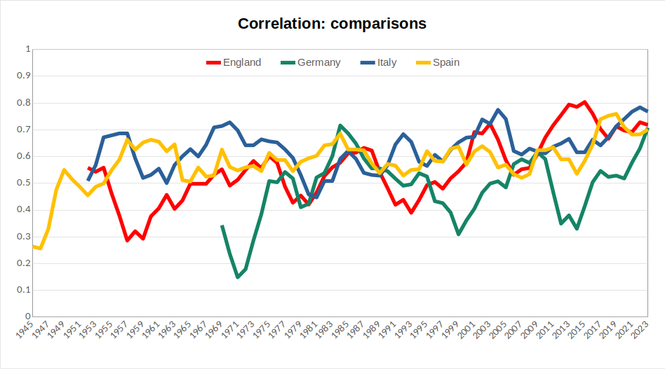
Fig 1: correlation comparison
(Lines here display five-year rolling averages for the correlation value between each season’s finishing positions and those in the preceding season for each of the four leagues discussed. See the introductory post to this series for an explanation of the choice of measurements.)
As noted in the individual commentaries, the Italian league has typically displayed slightly higher levels of year-to-year consistency, while the German and English leagues have been more prone to periods of real flux. All four leagues currently display correlation levels well above historical averages.
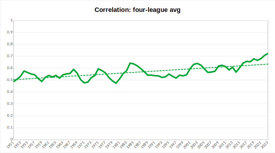
Fig 2: correlation overall average
(The line here displays a five-year rolling average of an average correlation value between each season’s finishing positions and those in the preceding season for each of the four leagues discussed. The dotted line indicates the overall trend in this measure. See the introductory post to this series for an explanation of the choice of measurements.)
An average across the four countries smooths out some of the variation to show a general rising trend across all leagues, indicating less fluidity of finishing positions. Furthermore, at present, the five year rolling average sits well above the trendline, which indicates that this is a trend that may currently be intensifying.
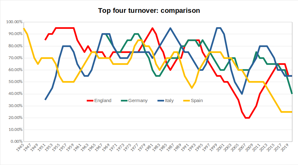
Fig 3: top four turnover comparison
(Lines here represent five-year rolling averages for each of the four leagues of the top four turnover measure, assessing levels of variation among clubs finishing in the top four of each league. See the introductory post to this series for an explanation of the choice of measurements.)
The most notable collective trend across the individual results is that each league has seen periods of sharp decline since the mid-1990s. In England, this is followed by something of a rebound (marking the emergence of a financial Big Six, which created greater competition for top four places), in Spain the decline is steady and continuous, in Italy there remains greater scope for variation.
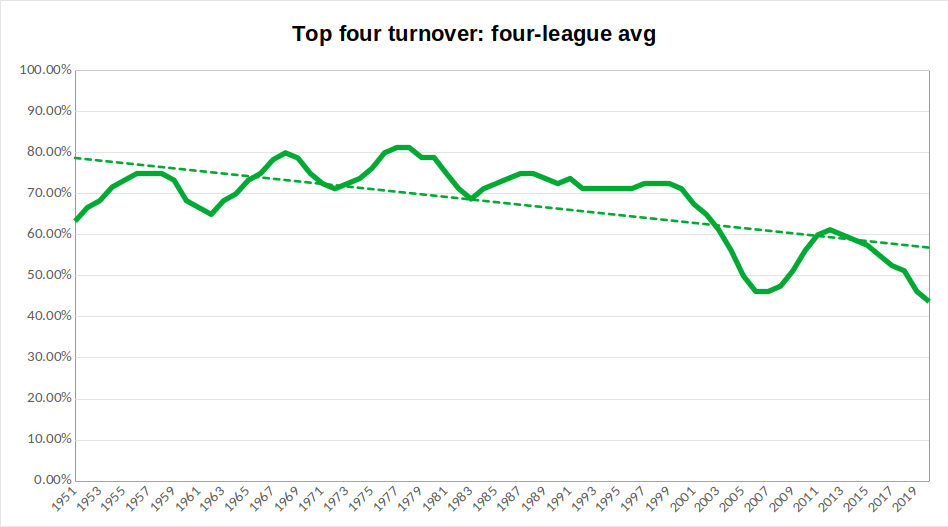
Fig 4: top four turnover overall average
(The line here displays a five-year rolling average of an average of the top four turnover measure, assessing levels of variation among clubs finishing in the top four of each league. The dotted line indicates the overall trend in this measure. See the introductory post to this series for an explanation of the choice of measurements.)
The overall average confirms the above trend: the overall direction of travel is downwards, but this is more marked from around 2000 onwards. Given that this was the point at which the Champions League was opened up to more teams from the biggest leagues, we can point to a clear effect of format changes at the continental level: the wealth attained through big club participation in Europe’s most prestigious competition allows these clubs to maintain a more stable grasp upon the top positions in their domestic leagues. As with correlation measure, the rolling average here sits below the overall trend, indicating this impact is intensifying. With further reform to the Champions League format, potentially enabling greater rewards for participants, even further decline in this measure is possible.
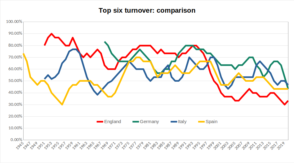
Fig 5: top six turnover comparison
(Lines here represent five-year rolling averages for each of the four leagues of the top six turnover measure, assessing levels of variation among clubs finishing in the top six of each league. See the introductory post to this series for an explanation of the choice of measurements.)
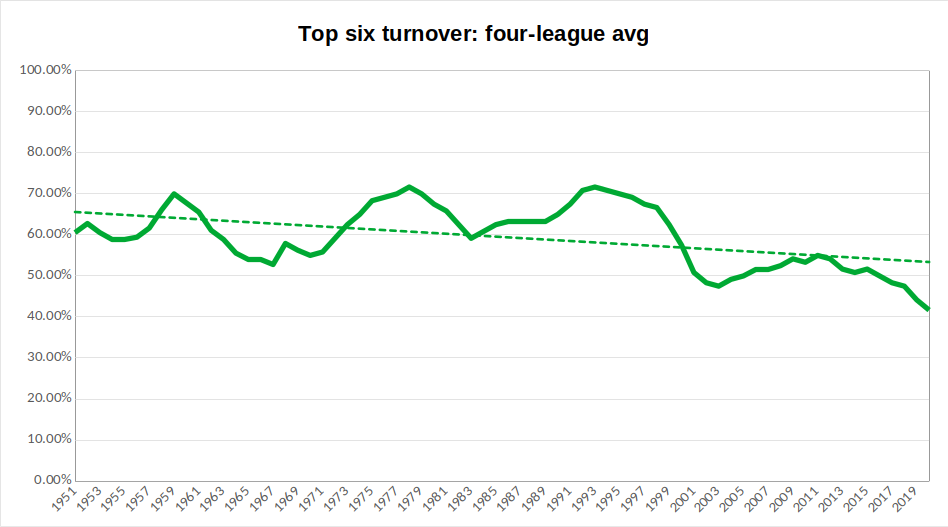
Fig 6: top six turnover overall average
(The line here displays a five-year rolling average of an average of the top four turnover measure, assessing levels of variation among clubs finishing in the top six of each league. The dotted line indicates the overall trend in this measure. See the introductory post to this series for an explanation of the choice of measurements.)
A similar effect is noticeable in the top six turnover measure. Prior to around 1995, there is no real collective trend in the results. Since then, to different degrees, all four leagues have seen decline in this measure. As a result, the decline in the overall average is notable and appears to currently be intensifying.
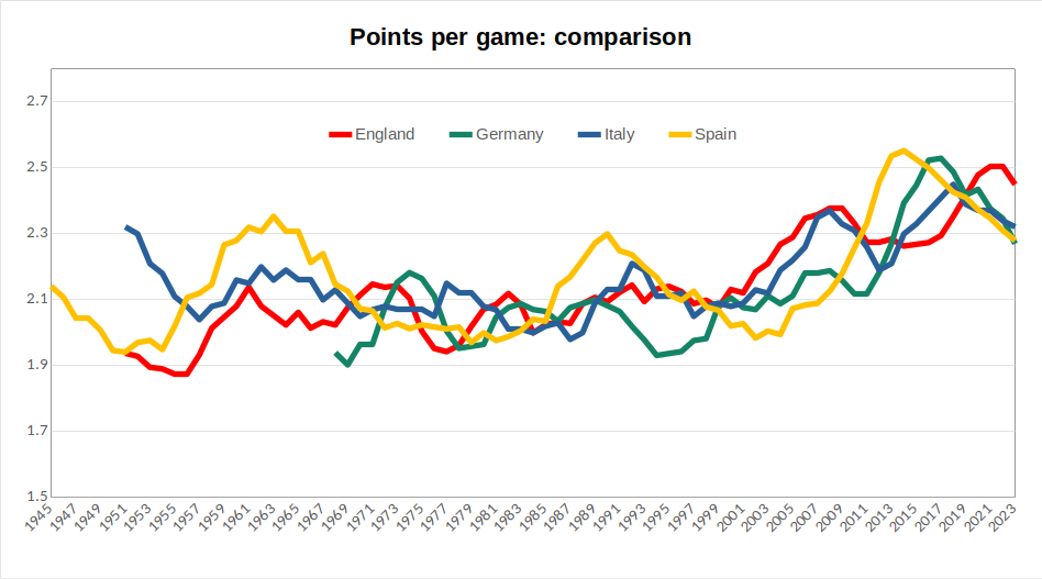
Fig 7: champions’ points per game comparison
(Lines here represent five-year rolling averages for each league of the points won per game by the team that finished champions. See the introductory post to this series for an explanation of the choice of measurements.)
In the individual commentaries, I highlighted the way that measures of dominance for championship winners enable some individual teams to be picked out. We can again, for instance, pick out the pinnacles of Real Madrid in the late 1950s/early 1960s and again in the late 1980s. But, beyond this, what is more apparent is that the recent steep rises in performance are consistent across the leagues, rather than being obviously attributable to individual teams. All four leagues have seen peaks of performance in the past fifteen years that surpass anything seen before.
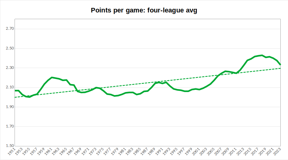
Fig 8: champions’ points per game overall average
(The line here displays a five-year rolling average of an average across the four leagues of points won per game by the team that finished champions. The dotted line indicates the overall trend in this measure. See the introductory post to this series for an explanation of the choice of measurements.)
When I was young, I remember my Dad trying to instruct me of the value of a hard-earned away draw by saying that a team who won all of their home games and drew all of their away games would win the league. Now, the averages here show that, while a title victory would not be entirely certain across these leagues, a two points per game average would certainly have made a team a contender up until about twenty years ago. Since then, it would leave you trailing some way back. So, alongside winning all home games, a team today would probably also need to win about one-third of those away and draw the rest in order to accumulate enough points to pick up a title.
Now, it is worth noting that the past few seasons display some regression in this measure. Is this a sign that we had reached unsustainable levels of dominance, or is it perhaps due to the financial hit taken by many of the big clubs through the pandemic? This is something to monitor in future years.
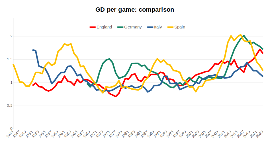
Fig 9: champions’ goal difference per game comparison
(Lines here represent five-year rolling averages for each league of the average goal difference per game of the team that finished champions. See the introductory post to this series for an explanation of the choice of measurements.)
While the overall shape of this chart is similar to that of points per game, with the performance of great teams visible a various different points, followed by a general recent rise, it is notable that the recent performance of Spanish and German champions jumped well clear of the other two leagues before both regressing. It can also be seen that, despite this season being poor by their recent standards, results here would point to Bayern still being the most dominant of the champions of the respective leagues.
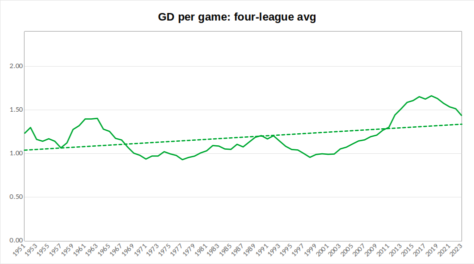
Fig 10: champions’ goal difference per game overall average
(The line here displays a five-year rolling average of an average across the four leagues of the average goal difference per game of the team that finished champions. The dotted line indicates the overall trend in this measure. See the introductory post to this series for an explanation of the choice of measurements.)
As I discussed in the Spanish and Italian commentaries, the period prior to the mid-1960s was one marked by some flamboyant champions. This is something that registers in the overall average here in values that would not be surpassed for another half a century. Recent years have seen champions of the four leagues consistently recording average goal difference of over 1.5 goals per game. The same kind of recent regression seen in respect to average points won is also visible here, so champions are not exerting quite the same level of dominance they managed across the 2010s.
Summary
Across all measures here, support can be found for the conclusion that competition within domestic leagues is profoundly influenced by the format of European competitions. The opening up of the Champions League to non-champions in 1997, then the shift to up to four teams qualifying from top leagues in 1999 corresponds to noticeable upswings in the average correlation of finishing positions, lower turnover in top four and top six finishers, alongside more dominant performances by champions.
In other words, dominance over the past 20 years is different to the dominance of Real Madrid in the late 1950s or Bayern Munich in the 1970s: there is a deeper structural foundation to it in terms of the way the Champions League allows for a massive concentration of financial power in the hands of the continent’s elite clubs, which makes it easier for them to defend their status from domestic challengers. And, with the coming expansion of the Champions League format, the structural unfairness visible within these figures has potential to deepen even further.